Here's the Harvard Business Review graphic.
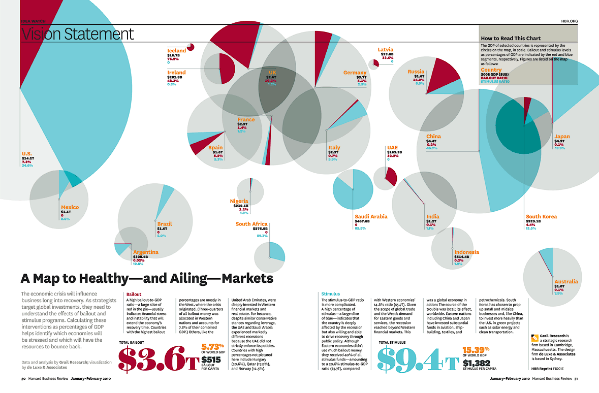
Each circle on the map represents a nation'a GDP. The bailouts and the stimulus are displayed as a percentage of GDP in red and blue.
Click here to enlarge and explore.

Related Posts
. "Lets be more like New Zealand" - Abbott
. Wind back the stimulus? Where's the love?
. Three wise economic monkeys