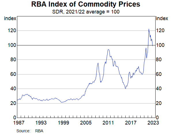
It's just out from the RBA
And thank heavens the ABS hasn't published a "trend".
Here's what I wrote about the ABS "trend" in response to a question from commenter Kymbos:
The trend is an off-the-shelf program stretched to something it is not equipped to do. It creates a smoothed line - fair enough if that's what you want, but really stupid at times when you are examining an event that is plainly not smooth, like the residential departures graph here.
In that case, and in several others, the Bureau has suspended publishing the trend to avoid printing something that would invite ridicule.
The real problem is in the way the Bureau has extended it.
It (mis)uses the program to produced a smoothed line right up the latest observation.
The only way to do this is by giving a lot of weight to the most recent observation.
But when the observation changes next time, the so-called "underlying trend" changes too, then it changes again and again, in a ways that are comical.
Look at where the "trend" for employed persons was heading in August.
Now look at where it was heading in August.
The trend tries to be wise after the event during the event. For recent observations it's crap.
Yes. I know the ABS keeps pushing it forward as something we must take seriously.
Related Posts
. The trend, the trend...why does the Bureau keep pushing forward the trend?
. Where are out export prices heading?
. At last, China really IS our biggest customer